SummeRun Brand & Event Refresh
Rivkin Center
Rumble Marketing, 2024
Role: Senior Graphic Designer
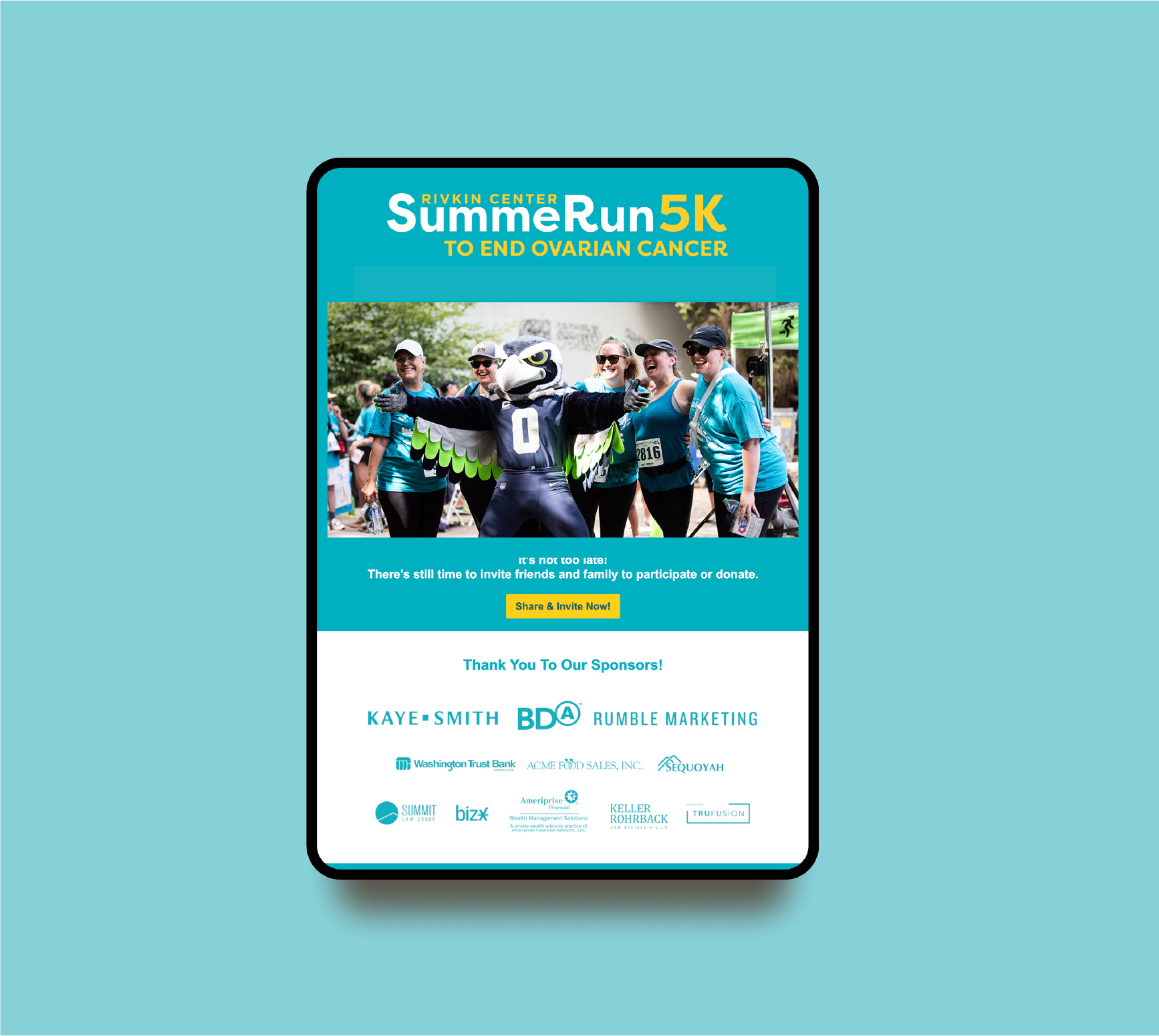
OBJECTIVE: Revitalize the event’s visual identity while honoring its established legacy. The redesign centered around three key objectives: preserving the iconic footmark symbol created by the event’s founder, Saul; infusing the brand with modern energy through vibrant color, typography, and streamlined design; and establishing a flexible design system that could evolve annually.
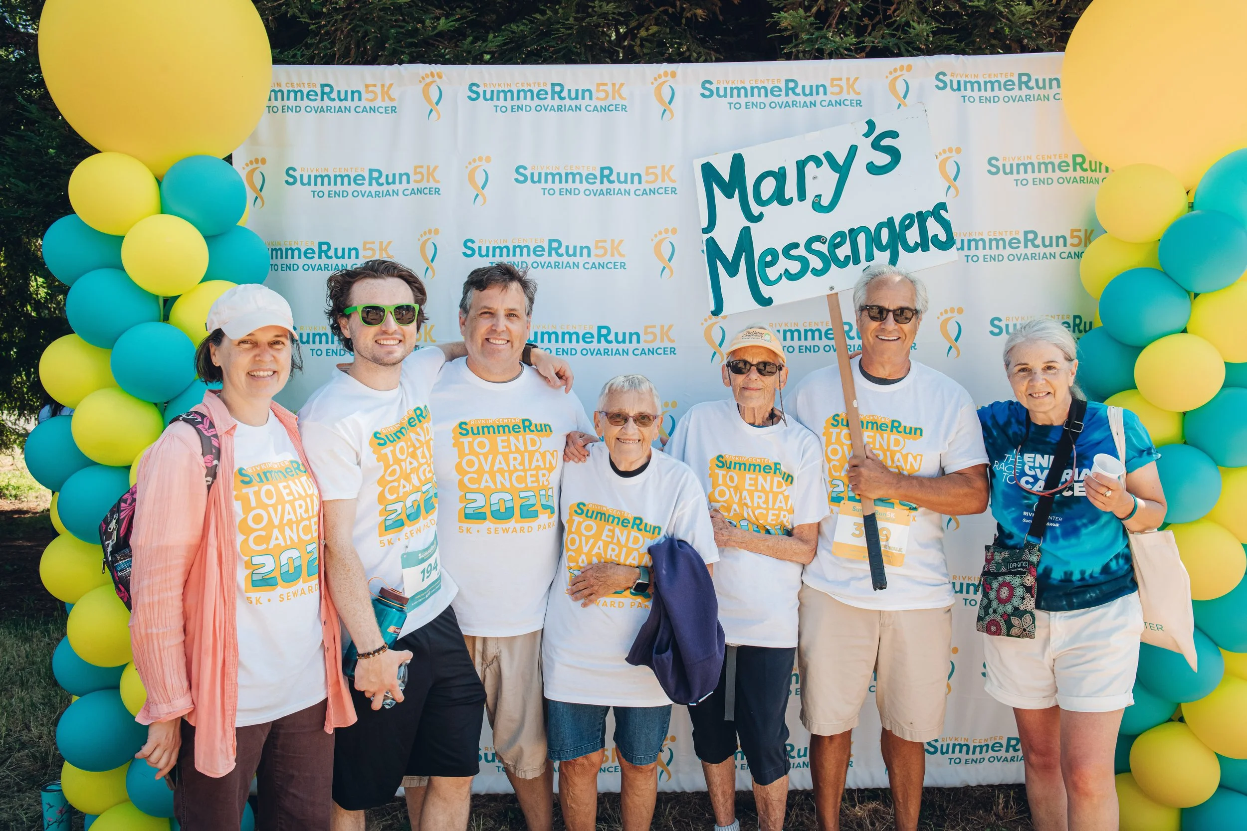
Key outcomes included refining the footmark logo with cleaner, more dynamic lines that retained its original essence while enhancing its impact. A unique and energetic yellow hue was introduced alongside updated fonts to breathe new life into the brand. Additionally, a comprehensive toolkit was designed, including a "Year Design" feature, to allow for each year’s theme to be creatively integrated into the brand’s visual identity. This adaptable system ensures that SummeRun merchandise, particularly the coveted event t-shirt, remains a highly anticipated and collectible item each year.
Logo Before


